
5 minute read | Lou Simeone | Simeone Graphix

This Illustration Uses The Common Formula For Rich Black
Rich black is a term used in CMYK (Cyan, Magenta, Yellow, and Black) printing to refer to a black color that appears deeper and darker than standard, 100% black (K) ink alone. It is achieved by mixing various percentages of the three process colors (Cyan, Magenta, and Yellow) in addition to the black (K) ink. The primary reason for using rich black is to create a more solid and visually appealing black color in print, especially when large black areas or text are involved.
There are different ways to create rich black, but the most common and widely accepted formula, as depicted in my illustration above, is as follows: C=60%, M=40%, Y=40%, K=100%
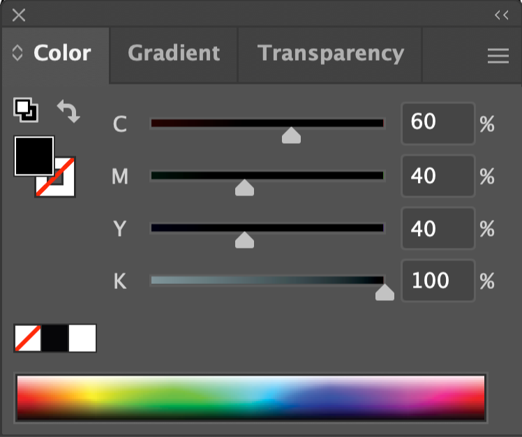
Common CMYK Rich Black Formula
This formula results in a deep, rich black that appears darker and more consistent, reducing the risk of a patchy or uneven appearance, which can occur when using only pure black ink.
When to Use Rich Black:
1. Large Black Areas: When your design includes large black backgrounds, it's advisable to use rich black to ensure a uniform and solid appearance.
2. Text: For text that is bold or set in larger point sizes, rich black can enhance legibility and provide a more appealing look.
3. Photographs: In photographs with significant black areas, using rich black can help achieve a more balanced and aesthetically pleasing result.
4. Rich Black Elements: If you have design elements that require a deep black, such as logos or graphics, rich black may be appropriate.
5. Print Quality: In high-quality printing, using rich black ink can enhance the professional appearance.
Rich Black Variations:
When it comes to CMYK printing, designers and printers have a variety of rich black options at their disposal. These options involve slight tweaks to the percentages of cyan, magenta, yellow, and black ink, and can achieve different visual effects. Below are some examples of common variations of rich black.
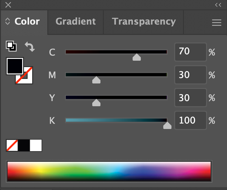
Cool Black CMYK Mixture
1. Cool Black: Cool black is achieved by increasing the percentage of cyan ink while maintaining a high percentage of black ink. This variation tends to have a bluish undertone, making it suitable for designs that require a colder, more modern feel.
Example: C=70%, M=30%, Y=30%, K=100%
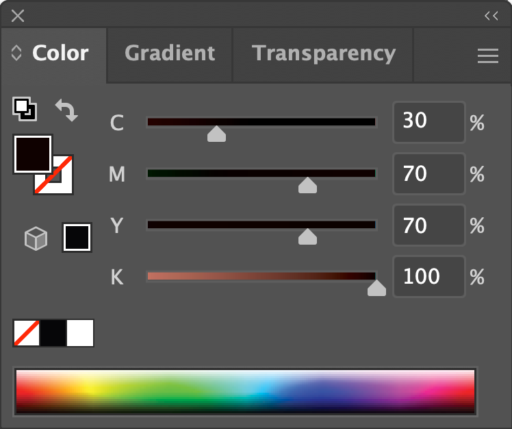
Warm Black CMYK Mixture
2. Warm Black: Warm black, on the other hand, involves increasing the percentage of magenta and yellow ink while keeping a high level of black ink. This variation results in a black with a reddish or brownish undertone, providing a warmer and more traditional look.
Example Below: C=30%, M=70%, Y=70%, K=100%
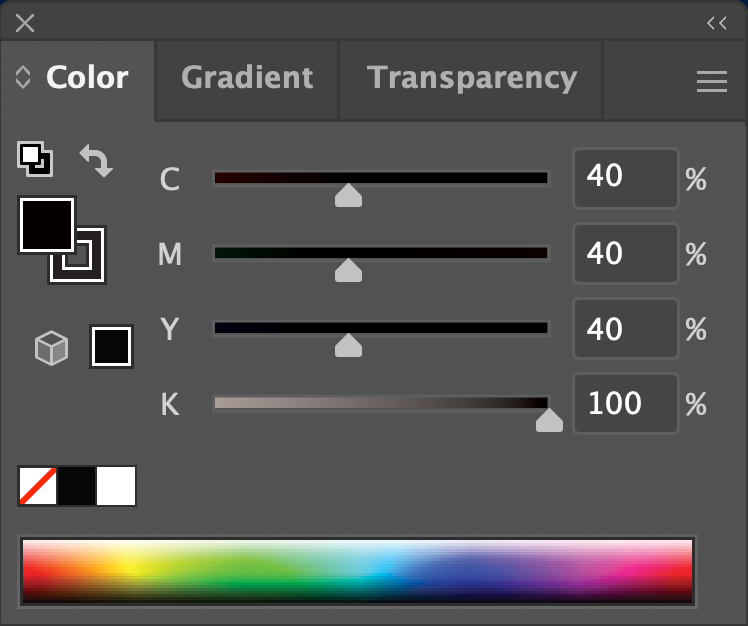
Neutral Black CMYK Mixture
3. Neutral Black: Neutral black aims to create a black that appears truly neutral, with no dominant color undertones. This variation is often used for precise and balanced black tones, especially in grayscale images.
Example: C=40%, M=40%, Y=40%, K=100%
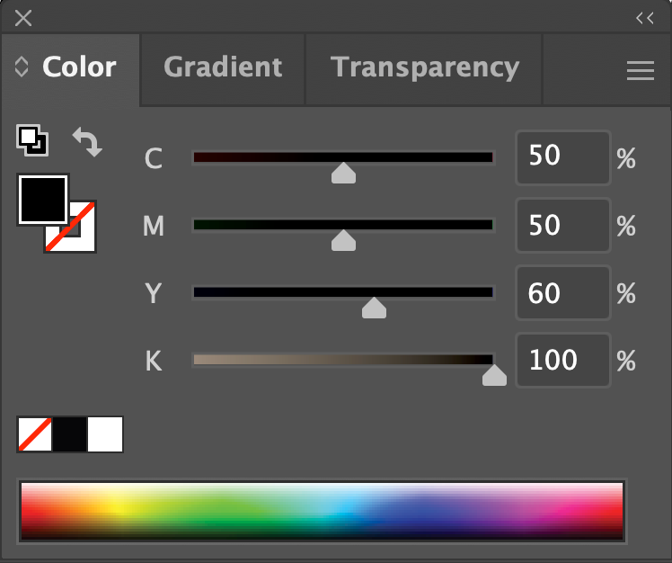
Rich Warm Black CMYK Mixture
4. Rich Warm Black: Rich warm black combines higher percentages of both magenta and yellow with a strong black presence. It creates a black that is not only warm but also rich and deep.
Example: C=50%, M=50%, Y=60%, K=100%

Rich Cool Black CMYK Formula
5. Rich Cool Black: This variation increases the percentages of both cyan and black ink, resulting in a black that is cool-toned and visually striking. It's often used for modern or high-contrast designs.
Example: C=70%, M=40%, Y=40%, K=100%
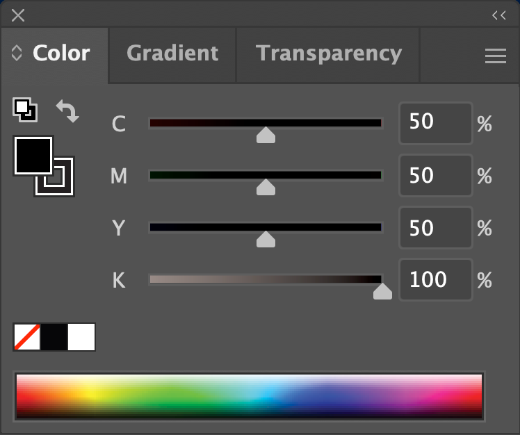
Photographic Black CMYK Formula
6. Photographic Black: In some cases, a slight increase in all four ink percentages can be used to achieve a photographic black. This variation aims to mimic the richness and depth of black in photographs.
Example: C=50%, M=50%, Y=50%, K=100%
It's important to note that while rich black can enhance the visual impact of certain elements in print, it may not be suitable for all situations. It's essential to strike a balance between pure black and rich black, depending on the specific requirements of your design and the capabilities of your printing equipment. Here are a few scenarios where using rich black might not be suitable:
Small Text and Thin Lines: Excessive use of rich black, especially in small text or fine details, may result in registration problems and readability issues. Small text and thin lines can appear blurry or illegible, particularly in offset or digital printing. For small and fine details, it's advisable to use plain black (100% black, 0% cyan, magenta, and yellow) to ensure clear and precise printing.
Printing on Thin Paper: Thin or lightweight paper can absorb more ink, causing rich black to bleed or show through on the other side of the sheet. This can result in a messy print, especially in double-sided documents.
Home or Office Printers: Many home and office printers have limitations in reproducing rich black accurately. Using plain black ensures a more predictable and reliable print outcome in these environments.
Color Matching: If precise color matching is essential, using rich black might cause variations in the final output due to differences in printer settings, ink types, or paper characteristics.
Digital Designs for Screen Viewing: Rich black might look good on a digital screen, but its appearance can differ significantly when printed. It's essential to adjust the black levels for print to avoid unexpected outcomes.
Always consult with your printing service provider to ensure they can accurately reproduce rich black in their printing process. They can also offer personalized suggestions and guidelines based on your specific printing requirements.
You might also like the articles below:

Looking for bold, unique designs? Explore my shop for a variety of exclusive products. Your support helps fuel my creative journey. Thanks for checking out my work!